A. Been blown out of proportion from the start
B. Already been changed five times
C. Taken over 80% of my thoughts
So here is the current color conundrum. I like color, but I fear color. I fear things won't really match and I want there to be a consistency throughout the house. I like lighter colors because I think they have more possible colors to coordinate with. I want a vibrant wall color, but would rather bring in interest with changeable accessories (curtains, flowers, pillows) than an over-the-top wall color.
Now that those somewhat-conflicting desires are out on the table, here's some of the color palettes up for consideration.
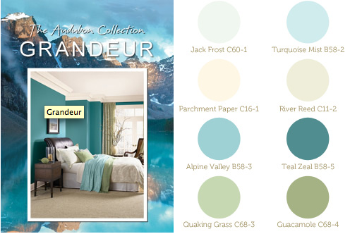
Olympic's Grandeur Collection: I like the teal a lot and this palette combines some brighter colors with some lighter colors. I feel a little stuck on what color would best go in the dining room because our everyday dishes are a teal that does not match these teals.

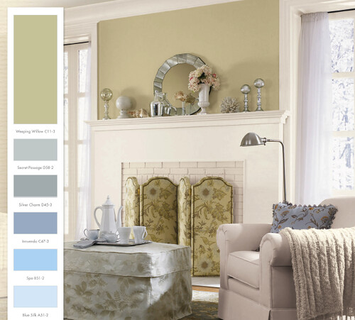
Olympic's Welcome Collection: No bright colors, but could easily match with anything. I could bring in reds, yellows, purples, or fun patterns to make things more interesting. Same issue with a dining room color.

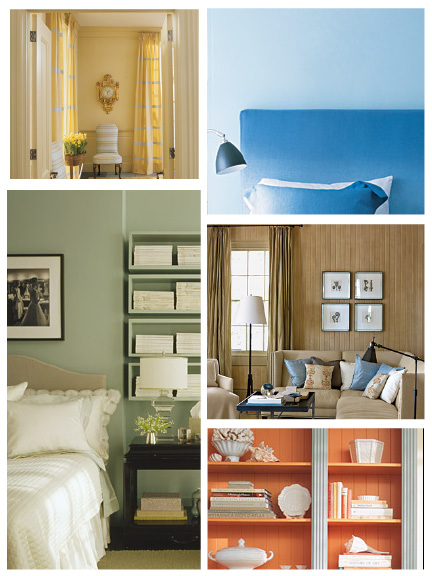
Martha's Natural Palette: Sweet, sweet colors! More than blues and greens! I want a coral dining room! Can you guess which is my current favorite?! This one!

Lee's favorite is Grandeur, but he gets to pick the lawn mower and the grill, so clearly that gives me free reign on everything else, right? Actually his current attitude is, "I don't care right now because you're going to change your mind 8 more times before we actually go to paint anything."
He knows me well.
UPDATE: Lee wants me to add that he could "dig Martha's paint", but I had only shown him the first two, and of those he preferred Grandeur. My bad. ;)

8 comments:
What about white and then a focus wall. So for example the front side of the fireplace is painted a bold colour - while the rest of the room is white or cream.
That Boy had dark blue on his fireplace in his student house and when the sun shone through the window it would reflect off the dark blue wall and make the whole room a lovely blue colour hehe
That's a good idea Hannah! Thanks!
I was totally going to suggest that - it looks fantastic, isn't overwhelming, and it means you can pick something more vibrant without fear that it will dominate the room or dictate the colour palette of your furnishings.
You and Lee are reenacting a conversation that my parents have about once a year, every time my mom wants to paint. It ends with my mom taking months to choose a color, then my dad painting, and then her looking it over and saying, "hmm... I'd really like this to be half a shade lighter... let's re-do it."
The plus side is that painting is relatively cheap and relatively easy, just time-consuming.
Good luck!
Oooo, I like the last one (Marktha's Natural Palette) the best as well. Honestly, I think you'd get bored if the entire house was in the same general teal-tan range. It would feel stifling, and then one day you'd see some gorgeous yellow or coral accent piece and not buy it because it doesn't fit in the narrow color palette.
I'm also thinking of my parents who decorated their entire house with shades of trendy orange and avocado back in the day. It was fine...for maybe five years...but then they wanted something new. And since the WHOLE house and all its accents fell in that color palette, it wasn't easy to tweak. And since they had kids, as you probably will, redoing the whole house at once wasn't an option for a good 20! years. You don't want that. Martha's is more tweakable and updatable. Go with her.
And then I misspelled Martha. Hmm.
Thanks for all the ideas! Love them! Ginny, I can totally see me and Lee doing that from now until we die.
I love love love the Olympic's Welcome Collection. :)
Post a Comment